


I recently bought a book to help with digital painting; Digital Painting Techniques. I haven't previously used most of the techniques that I've been reading about in the book so I decided to follow one of the tutorials (directly this time) and see how well it turns out.
I'm pleasantly surprised with this and, while it doesn't look as professionally done as in the book (of course), I find that the final result is easy to read and relatively detailed for my first attempt.
This painting is supposed to look kind of dark but, when looking at it using some different monitors, it looks almost completely black aside from the barn. If anyone knows what I could do so everyone can see it as intended, please let me know. Thanks!


Some pretty quick, rough sketches in charcoal (images 1 and 2) and graphite pencil (image 3)

A pretty quick rough sketch to detail Thumbnail #17. I generally prefer a more painted look when I make concepts but lineart can sometimes be more easily read so I gave it a go. I think, overall, it turned out well and I could have spent longer on it but, seeing as it's just a thumbnail, I've spent enough time already.


Das Cabinet des Dr. Caligari (1920) has a recognisable art-style to anyone familiar with the work of Tim Burton. Considering the fact that the film is in black and white, Wiene had to make a conscious effort with shade choice while creating the characters’ outfits and sets otherwise everything would blend together, and he did an amazing job of it. Das Cabinet des Dr. Caligari, much like other films of the era, is very much influenced by German expressionism and, because of this, the movie features a lot of "weird gaping and gurning" (Peter Bradshaw, The Guardian, 2014). The film, as a whole, isn’t particularly bright but the dark clothing and makeup worn by the actors, especially that of Cesare (Conrad Veidt), is extremely striking and adds a great deal to the overall feeling the viewer receives during the film. The overall appearance of the characters is very similar to that of the scenery surrounding them; this is most noticeable in Cesare (Conrad Veidt) as his body is distorted, lanky and "just as askew as the sets themselves" (Clayton Dillard, Slant Magazine, 2014).
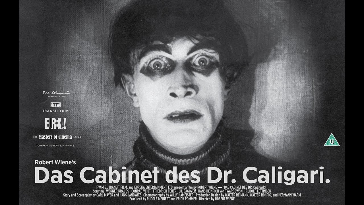
Robert Wiene’s use of jagged lines throughout the movie
helps to define what is being seen. For example, any text representing Dr. Calagari
(Werner Krauss) would appear jagged and manic whereas any other characters’
text would be neat in comparison. These kinds of shapes are used frequently in
scenes to represent a vast number of things such as Jane’s (Lil Dagover)
bedroom being very feminine and curvaceous (as does the asylum to represent a
calming atmosphere for the mentally ill) whereas the fair is very pointed and misshapen
to create a feeling of uneasiness and danger. The town square, used relatively
frequently during the film, is purposefully very distorted, much like the fair,
to give the area as a whole a very strange, creepy and unnatural feel. These
very clear shapes and directions are given to each character of importance and
help immensely in setting them apart from one another as well as getting an
instant understanding of who/what they are in the general story arc. The set design allows the viewer to get suckered in and for the film itself to alter what the brain feels, as concurred by Roger Ebert in his review of the film; "Weine has made perfect use of settings designed by Hermann Warm, Walter Reimann and Walter Roehrig, settings that squeeze and turn and adjust the eye and through the eye the mentality" (Roger Ebert, 2009).

Bibliography-
Quotations:
Ebert, R. (2009), The Cabinet of Dr. Caligari, RogerEbert.com:
http://www.rogerebert.com/reviews/great-movie-the-cabinet-of-dr-caligari-1920
Bradshaw, P. (2014), The Cabinet of Dr. Caligari, The Guardian:
https://www.theguardian.com/film/2014/aug/28/the-cabinet-of-dr-caligari-film-review
Dillard, C. (2014), The Cabinet of Dr. Caligari, Slant Magazine:
http://www.slantmagazine.com/film/review/the-cabinet-of-dr-caligari-1920
Images:
https://www.eurekavideo.co.uk/moc/das-cabinet-des-dr-caligari#
https://www.youtube.com/watch?v=hSzvBw7Dh5I
https://jpkcinemaadventures.wordpress.com/2012/06/17/the-cabinet-of-dr-caligaridas-cabinet-des-dr-caligari-1920/
http://www.homecinemachoice.com/news/article/das-cabinet-des-dr-caligari-masters-of-cinema-review/19979

Argia is a dark and dingy city hidden deep beneath the ground with no entrance/exit.
Calvino describes Argia as being very tight, so tight that it's unknown if the citizens can move around.
I decided not to make it too close and claustrophobic because, without room to move, the people living here would just die. However, I made the city dank and dirty, surrounded by rocks with no citizens outside to achieve a similar effect.
My favourite of these is definitely 17. I think it represents Calvino's description the best as it looks very dark and dirty with some kind of clutter lining the streets.


The same as the black and white still life exercise, I use a brush that is new to me. I set out with this painting attempting to at least somewhat recreate a painterly effect. Considering this is my first attempt, I think I was quite successful.

For this task, I used brushes in Photoshop that I had not used previously. I really enjoyed the way the brush I chose to use would give whatever I was creating a very painterly effect. While I think it could have been improved by having harder edges, I find that the overall aesthetic of the painting is appealing.
A thorough list of some of Italo Calvino's cities from his novel 'Invisible Cities' and my thought/takes on each one.
Here, I have highlighted areas of the text that explicitly give information to the appearance of the various cities described by Italo Calvino or their inhabitants. This will hopefully help with discerning useful text from the text that doesn't give any important information from an artistic standpoint.
If you see anything that you think would be useful for me to take note of but I haven't already highlighted, please let me know.
Despite this trailer now being five years old (and the game
itself cancelled) I still find that this cinematic trailer influences my sci-fi
work a great deal. So much so that, for one of my college assignments, I
designed a character and gadgets that would fit in this world, going so far as to model and animate some of these gadgets in Maya.
