Group Project Logo - Ideas
22:58Michaela, Douy and myself were put together as a group for this term's project and, after a bit of a struggle, decided to call ourselves 'Twisted Turtle Studios'. We then quickly came up with a plan to each go off separately and design some logos, consulting each other along the way. This is what I came up with:
We all agreed that the more simplistic and playful look of 3 and 4 worked best, but looked more like a tortoise because I gave it legs instead of flippers
I then set out to design the flippers, trying to replicate the simplicity of the original design while keeping it recognisable. We agreed that 2's front flipper worked best, but the rear flipper of 3 was much more interesting
Michaela suggested getting rid of the facial features for a more simplistic look, as the nose and eye didn't add much to the overall design. We also decided to ditch the spikes on the turtles' shell as, again, they didn't add much to the logo
After trying a fair number of colour combinations, we decided to go forward with 3, 14, 15 as well as a mixture between 10 and 14.
I still wasn't quite happy with the way the designed looked, so I completely removed the line art which created a much simpler and more professional look to the design
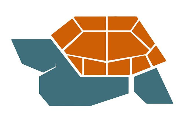
I then created a bigger gap between the shell and the body of the turtle, and better defined the gap between the turtles head and flipper, resulting in this as the final design


0 comments